Saturday, September 25, 2010

Mad Mario: Getting Warmer

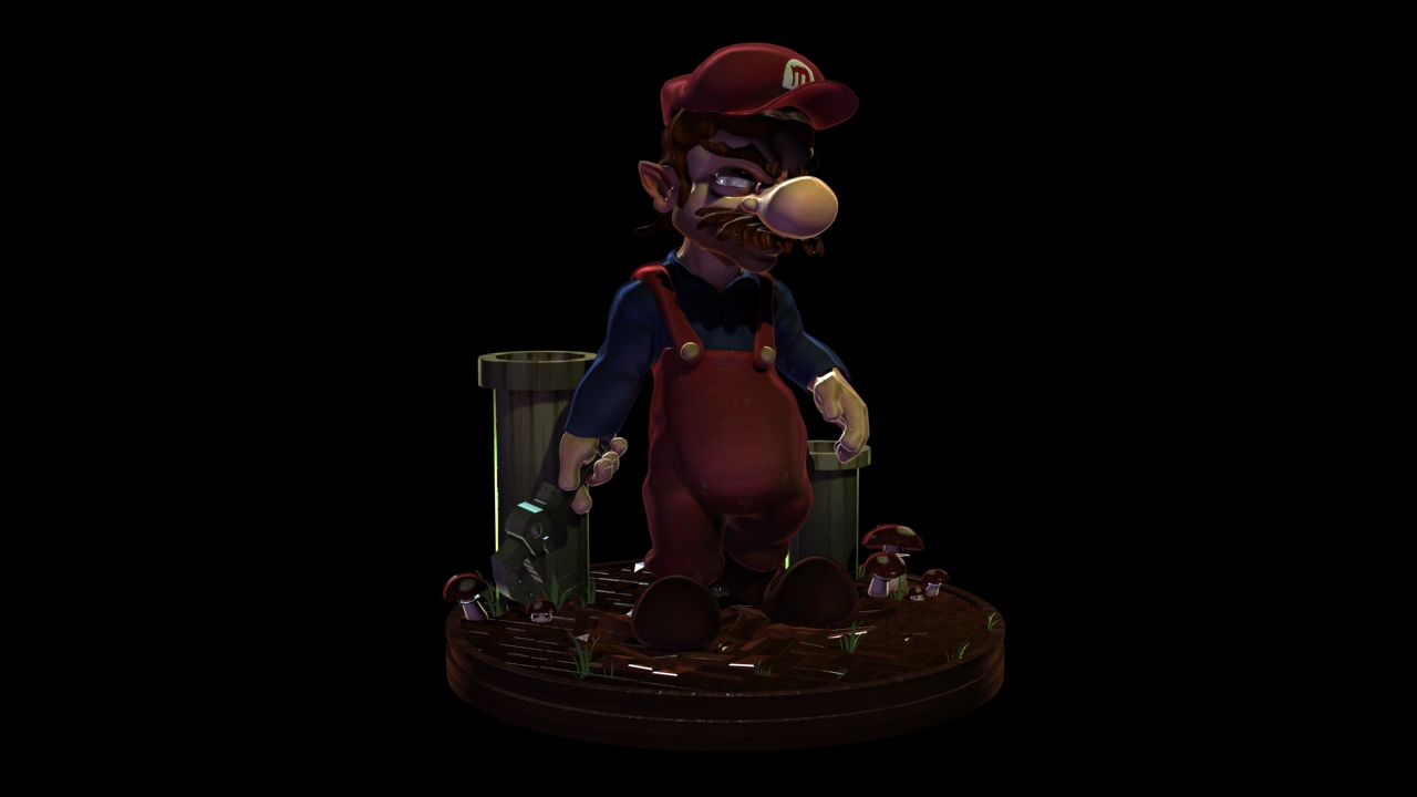
I've been playing around with the materials and lighting a little more. I settled on more a an glowy ink feel rather then realistic. I created several subsurface scatter tests and I wasn't pleased with any of the results. It doesn't fit with the overall design aesthetic. SSS feels very obvious, even if it's effects are tuned way down.

So I have a pretty complex shader tree that is utilizing several falloff maps for things like self-illumination, specular levels, specular color, glossiness, among several others. I'm really happy with the outcome so far. I am playing around with the lighting to get the right contrast balance. Ultimately I'll play a lot with the final images in post, but they are getting close.

I also created a quick background comp, just to arrive at an understanding of the mood I'm going for. Initially my thoughts were to go with an underground sewer feel, similar to the 2nd level in Super Mario Brothers. The level uses blues and aquas, with lots of piping in the background. After playing a bit, I'm thinking about going for more of a toxic surface feel. I think it would be fun to see what a brick desert would look like from the game. The sickly yellow-green really makes Mario stand out, in a positive way.

I was shying away from this because Togo is using the same sort of color scheme, but I think I can pull off enough differences that it won't look completely similar. I also want to toon the feel up a little, so that Mario's section of the demo reel will be a nice transition into the Secret Agent segment (see older posts).


Wednesday, September 22, 2010

Mad Mario: Lighting and Materials

Currently I'm playing around with lighting and material tests. I feel like the material really needs to look like a cartoon without being cartoony. The point of Mad Mario, is that it studies the darker nature of Mario's actions. It's a deep character study.

I want to convey this message completely through visual means for the reel. The lighting and materials reflect this best. Because of this, I have to come up with some creative solutions. At the moment I'm using a custom falloff map as a specular map. This way the character will always very bright rim light on the edges. This makes him pop from the environment a little more then normal.

At the same time I want to create some high contrast with the shadows. Really dark areas of the character that I would normally want to see, such as the face. It creates mood, but also lets the rim light on the edges of the hat and head be the focus.

I'm looking at several pieces of illustration as inspiration right now. Comic books are extremely helpful. Frank Millar's Sin City is particularly helpful when working out contrast.

I still have a long road ahead, but I think it's coming along.


Sunday, September 19, 2010

Mad Mario-Turntable

Finally worked in a few hours to work on the base and lighting for Mario this weekend. I'm juggling around a few approaches for the shaders, which ultimately will make everything "pop" more. I'm very interested in working on a backdrop painting for this one.

I initally went very moody with the lighting, but I need to lighten up the scene since this is for a demo reel. Otherwise we won't be able to see the character.


Sunday, August 22, 2010

Mad Mario Character Pose

Currently I'm working with posing and building the stand of this character. This is a ton of fun to work on!


Wednesday, August 11, 2010

Presentation Shot

I ended up with two different versions of the "presentation opening" for Togo. This is the format in which you will be introduced to each character in the demo reel. I initially wanted to give each character a different screen, but I wanted a unity to the reel that I was lacking the first time around. I might slightly alter the look, but the Agents and Mario's page should look very similar.

I have two variations. The one is more of the early 1930's deco feel. Sepia tone throughout. The second is almost identical accept for color palette. Here I wanted to introduce more black and white contrast, as well as subtle sickly green. I felt that I wanted something on tone to match the classic Universal Pictures monsters. I was going for Frankenstein. I've been looking at them so long that I've lost my artist eye. I'll sleep on the decision.


Sunday, August 8, 2010

Demo Reel- Still Image Preview

After about two weeks of solid rendering I finally have 4 shots completed for my demo reel. Here's a little preview below. I'll upload some video previews later this week.

Monday, July 12, 2010

Togo Posed

I'm a little bit closer to being finished. Right now the character is posed and I'm working on the base and materials. I have a tiny bit of tweaking yet to finish on the main character, but it's on it's way.